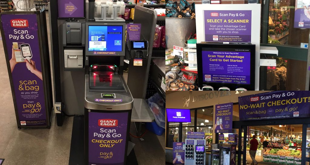
The Scan Pay Go Program was designed to revolutionize the shopping experience by leveraging mobile technology. It enables customers to scan and shop using three key touchpoints: a kiosk, where they can either pick up a device or download their own app; a scale station; and a checkout station.
Our design team was engaged to enhance the experience following significant confusion and negative feedback on the program.
Before Redesign

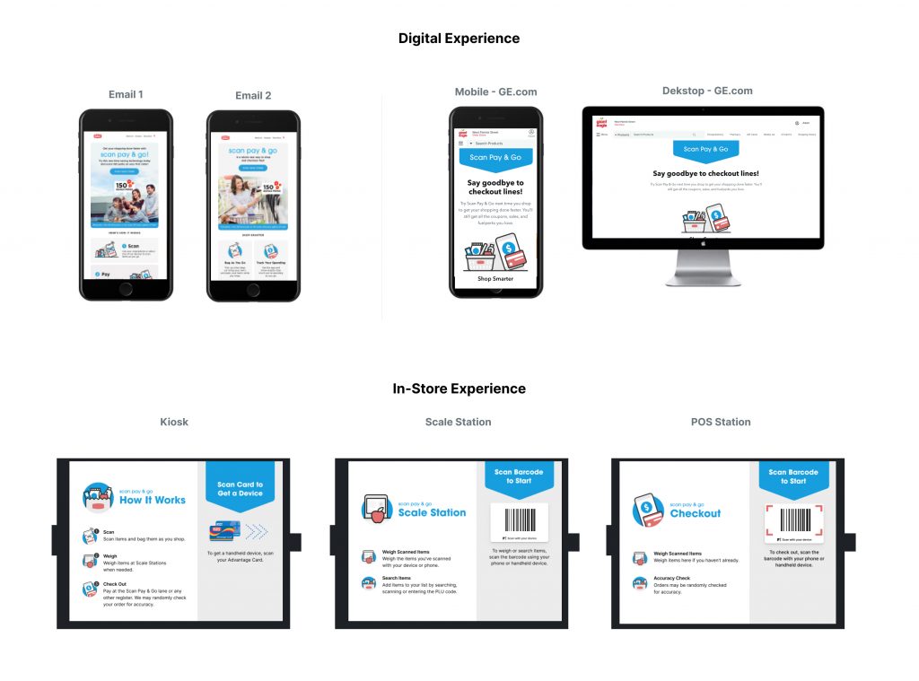
After Redesign

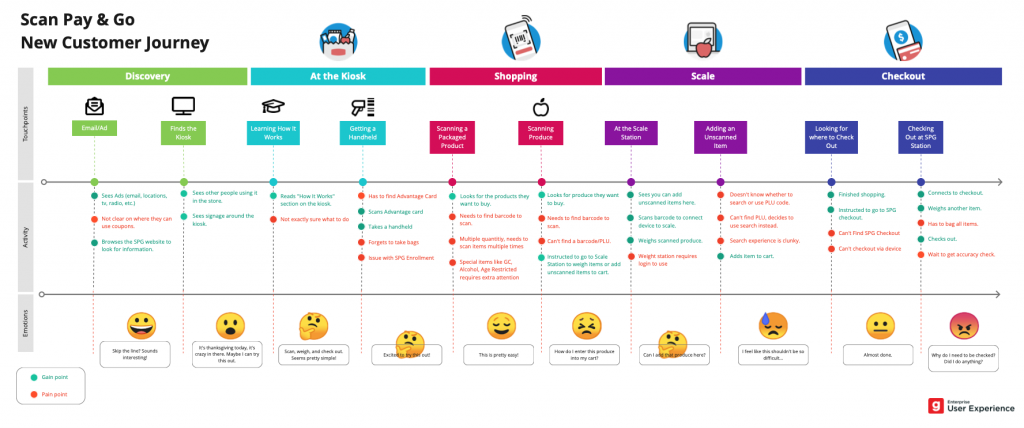
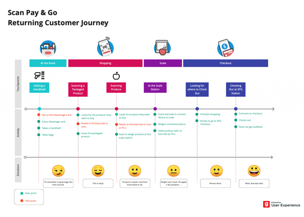
Journey Maps


Our Approach
We started by analyzing customer feedback to identify key pain points and created a journey map to visualize the overall experience. Additionally, we conducted in-person interviews and observed participants throughout the process, noting areas of confusion and difficulty.
Using these insights, we proposed a cohesive redesign focused on improving in-store guidance and signage. Our primary goal was to help customers navigate a busy environment. To do this, we introduced animations that capture attention and provide instructions—whether guiding customers to place produce on the scale station or prompting them to scan their loyalty card at the kiosk to unlock a scanner. We also enhanced the checkout area with clear signage that directs customers on where to complete their transactions. We also provided clear instructions at each kiosk for additional guidance.
Overall, our unified design and subtle improvements help improved the program significantly, reducing customer confusing, while increasing adoption.


